The case for proportional programming fonts
Martijn Storck
Proportional fonts are everywhere. Whether you’re reading a magazine, browsing a website or looking at a news paper from the 18th century, the letters that make up the words are varying in width making for a pleasant reading experience and nice aesthetic. Early computers broke with this convention; on early video adapters and printers it was easier to align text in a columnar grid of equally wide glyphs. While most of the computer world long abandoned this concept with the introduction of graphic user interfaces, most of the programming community stuck with this monospaced grid of letters. The past decade has seen countless of interesting typefaces dedicated to programming, but almost all of them stuck with the monospace proportions. Instead of wondering why, first let me illustrate the difference.
Examples
Here is a bit of C# code in a proportional font, Input Sans:
Nothing out of the ordinary here. The text looks great and the indentation on the left hand side has not lost any semantic meaning.
Now look at the same example in a monospaced font out of the same family, Input Sans Mono:
Again a good looking piece of text that even maintained the italics. But if you open these images in separate tabs so you can quickly alternate between the two you can easily spot the differences. Some things that stand out:
-
On line 27, see how the letter ’m’ is squished to fit in the grid, while the letter ‘i’ was artificially widend using serifs to avoid a large gap between it and the surrounding letters.
-
On line 29, notice how the terminator on the letters r and e had to be cut short in the monospace variant to make it fit.
Everywhere in life proportional fonts are the norm. Looking at the above example, is there any reason to prefer the monospace variant? You spent hours looking for a pretty color scheme, why ruin it with a font that sacrifices looks for an old-fashioned monospace grid?
Any font will do
There are a few proportional fonts specific to programming, like Input: Fonts for code and Go fonts. But once you abandon the need for monospace, every font becomes a programming font.
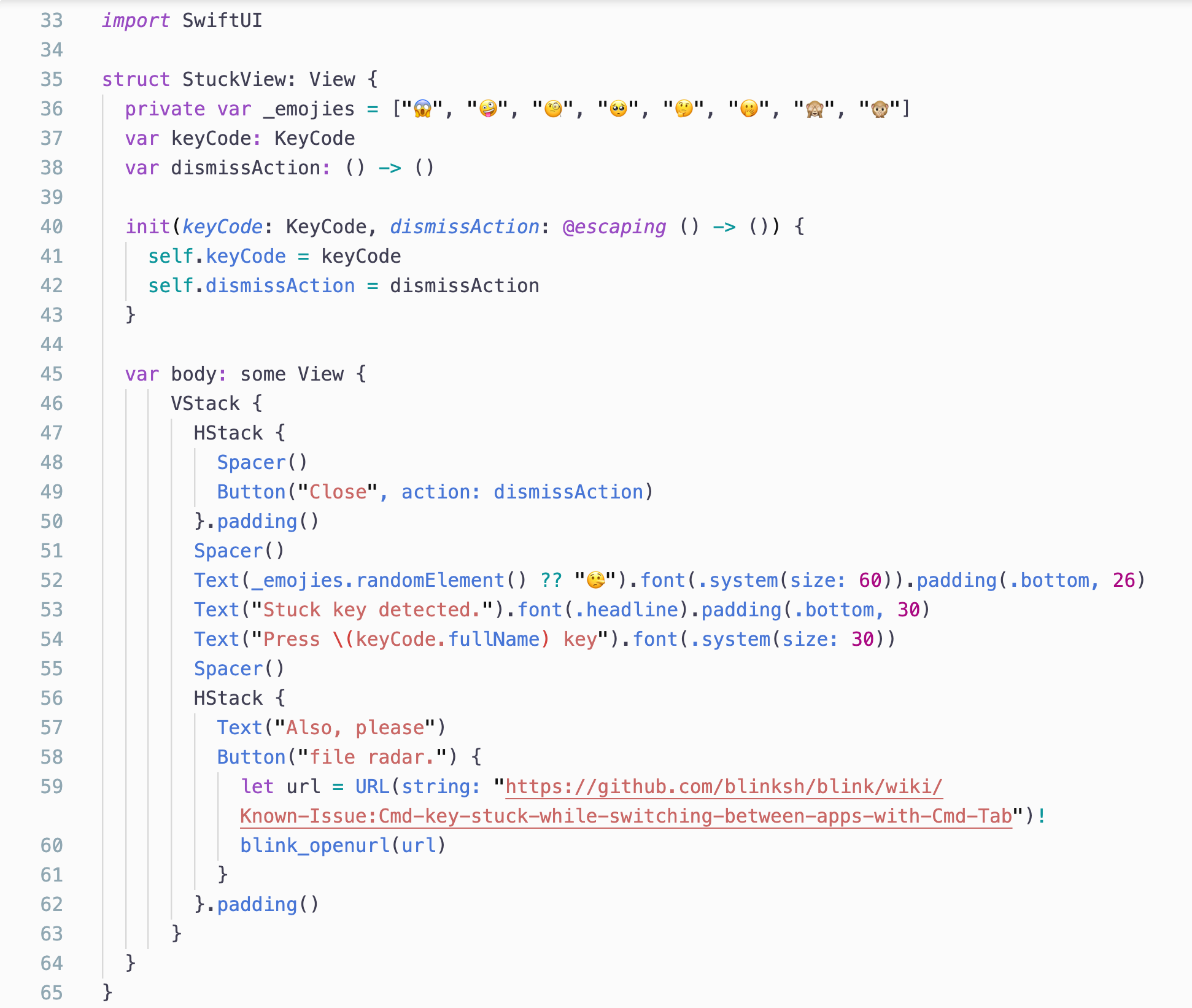
For example, take this bit of Swift code in Apple’s system font, San Fransisco. The choice of typeface makes this look familiar to any Mac or iDevice user:
Now compare it to a popular monospace font by Apple, Menlo:
I bet if you worked in San Fransisco for just a day, Menlo (which is a great font in it’s own right) would feel crude and dated.
Fears and actual issues
We need spaces for indentation
No you don’t. Think about it, all spaces are the same width so whitespace indentation on the left are still equal.
My pretty tables are misaligned
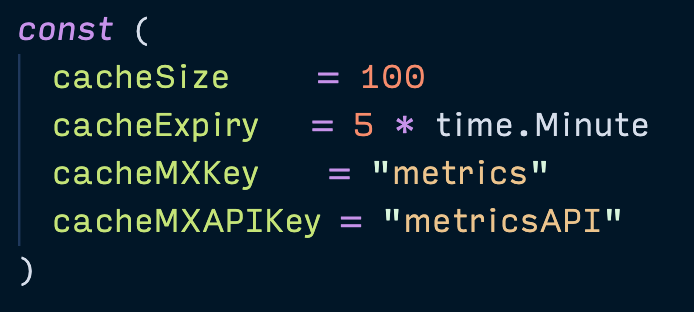
This might be an issue depending on the code style in your team or formatting tools you use. For examples Go programers usually format their code automatically with go fmt which aligns the = signs in a series of declarations. This breaks when using a proportional font, leading to a series of jagged equal signs:

This doesn’t look pretty, but with modern tooling there is no need to worry about this. When adding an extra line to these constants you don’t need to switch to a monospace font to manually align the = sign because your formatter takes care of that automatically anyway. There are interesting ideas to fix this presentation, like Elastic Tabstops but so far they haven’t really taken off.
If you rely on manual alignment of tabular data you might want to invest in better tooling to save youself a lot of time and frustration. The same goes for blocks of right-hand side inline comments.
My terminal apps misbehave
Valid point. Terminals are a place where proportional fonts have no business.
My editor doesn’t support it
Have you tried it, though? I know Visual Studio Code, Xcode and emacs are fine with it. Even Microsoft Notepad is!
Conclusion
I’ve been using a proportional font exclusively for over a year with various languages (Ruby, C#, Go and TypeScript) and have found it a net positive. I encourage everyone to try it out a proportional code font like Input Sans for a day! .
Color scheme for all the screenshots: Night Owl and Night Owl Light. Rendered with Visual Studio Code on macOS.


